Background
CONTEXT
Because Workday users currently need a more streamlined, intuitive way to apply for resignation and termination, we conducted user research to understand how users perceive and interact with the proposed designs for termination and resignation in Workday.
OBJECTIVES
Understand how users perceive and interact with the Workday termination and resignation workflows to inform the trajectory of the proposed designs.
Learn how successful Workday termination designs are in helping users achieve their goals, address their needs, and easily understand what they’re doing with minimal assistance.
Research Approach
Synthesis & Readout
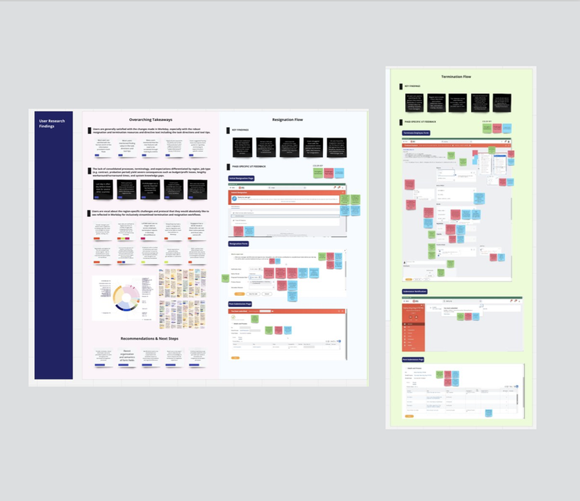
From thorough user feedback collection and synthesis, the UX team was able to report out key challenges and opportunities for improvement with stakeholders to drive palpable changes. As shown below, I synthesized our findings and arranged a visually engaging Miro board featuring the overarching takeaways, opportunities, and page-specific usability testing feedback with color-coded stickies indicating the strengths, weaknesses, and opportunities that users mentioned during the testing sessions.
UX-Driven Accomplishments
Based on UX research insights, stakeholders implemented the following improvements:
|
|