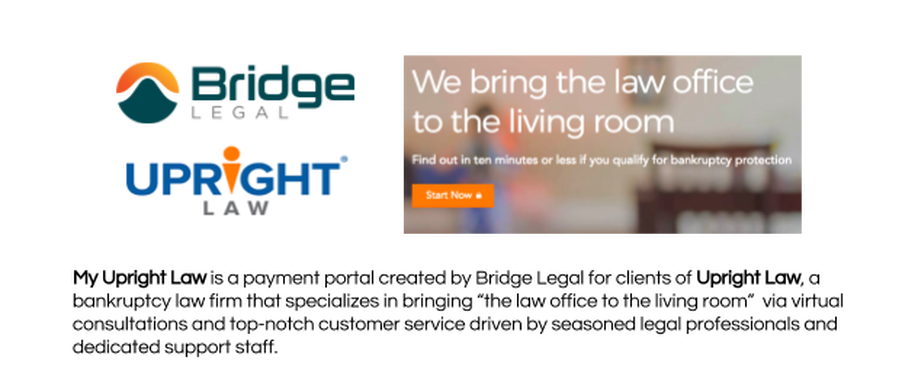
Meeting Our Client, Bridge Legal
|
Bridge Legal Technology is the legal software firm that built the client portal for Upright Law, their premier client. Their current long term goal is to create one-stop shop software for a payment processor, CRM, and client portal that will satiate the needs of both attorneys and clients.
I was on a team with two of my cohort mates, Rachael and Steve. None of us knew much about bankruptcy, so we were curious to find out about the bankruptcy filing process and what our users were candidly experiencing. |
|
Exploring The Existing Product
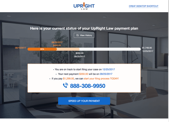
Jocelyn explained to us that users decide on a payment plan for their filing fee and are able to check their progress and speed up their payments through the client portal. We took an initial look at the portal to grasp the concept and feel of the product.
Jocelyn explained to us that users decide on a payment plan for their filing fee and are able to check their progress and speed up their payments through the client portal. We took an initial look at the portal to grasp the concept and feel of the product.
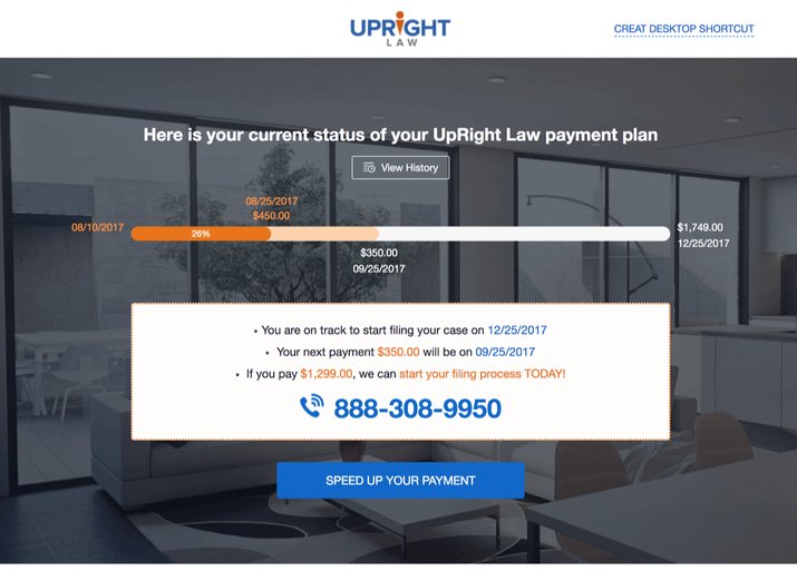
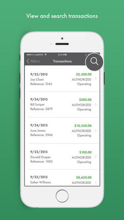
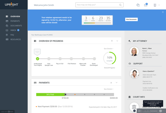
Jocelyn gave us access to a demo account for the existing client portal. After logging in via client ID, I was led to a screen with a payment
progress bar that had dates for past and future payments, a payment history button, and call to action to “Speed Up Your Payment.”
progress bar that had dates for past and future payments, a payment history button, and call to action to “Speed Up Your Payment.”
|
The first question I had was, “How do I pay?” “Speed Up Your Payment” seemed to be the closest thing to making a payment, but it felt counterintuitive. Why would someone want to speed up their filing date every single time they are on the website, or even want to see the button when most clients can’t afford it? Another snafu we noticed was the listing of future payments under Payment History. The semantics of that feature failed to come under a consensus and lacked testing.
|
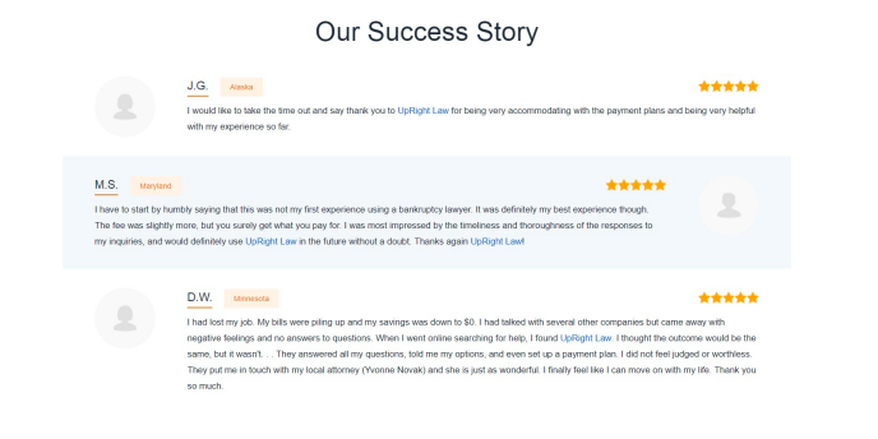
Jocelyn did tell us that she showed and walked through the site with several people, but there was a lack of feedback
about the value that users received from client testimonials and the calls to action on the payment portal.
about the value that users received from client testimonials and the calls to action on the payment portal.
Diving into research
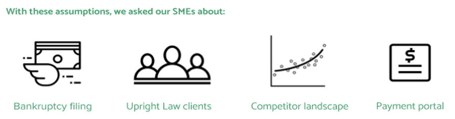
To pinpoint the problem, we sought credible information through SME interviews, user interviews, domain research, and competitor analysis.
To pinpoint the problem, we sought credible information through SME interviews, user interviews, domain research, and competitor analysis.
|
After viewing Upright Law’s current portal screens, we wondered:
|
At this point, we assumed:
|
So what does the bankruptcy process entail?
Users most commonly elect to use a Chapter 7 or Chapter 13 plan. Chapter 7 is tied with collateral and stays on your financial record for 10 years but requires less fees, while Chapter 13 lasts on your record for 7 years but requires partial payments during the first five years of bankruptcy.
With Upright Law, clients are immediately matched with an attorney who guides them through the process and files their petition once they have paid their retainer fee.
Since many users are unable to pay their fees up front, they are given a payment plan to make the process more feasible as well as a client portal account to track their progress.
After they have completed their payment, clients are able to file their petition and must gather required documents to create their petition. The attorney will receive the documents and craft the petition to write out the story of the filer in a genuine and empathetic way.
Once this is done, the client, attorney, and trustee will come together and review the petition. After review, the client will sign the paperwork required to complete the process and be discharged with their bankruptcy status finalized. All of their financial debt will be cleared and give them a fresh slate.
|
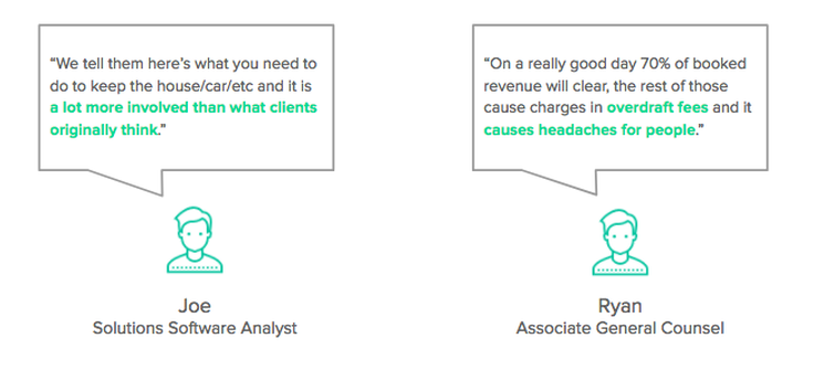
Joe, who has worn a lot of hats at Upright Law, told us that while the internal technology is advanced, the client facing technologies of Upright Law are lacking. He described the clients as not tech savvy and requiring everything to be self-explanatory with simple calls to action.
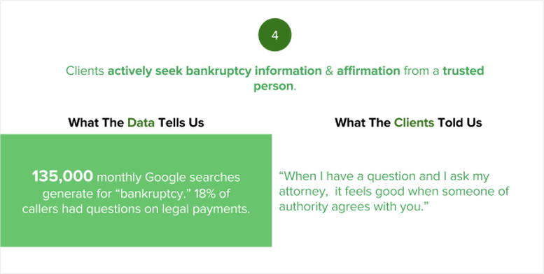
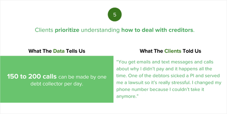
Clients lack substantial knowledge about the bankruptcy process and need transparency about hidden fees, payment processing errors, and dealing with creditors. Rather than fancy iconography, he believes that steadfast efficiency and simplicity would boost the product’s impact. According to Joe, “Anything we can put in where a client calls one less time is a win.” Ryan, an attorney at Upright Law, shared similar sentiments as Joe. The success of Upright Law comes from its attorneys and the virtual platform. According to him, clients feel safe from the stigma and reassured that their financial burdens will be alleviated. He also said that the client portal doesn’t give users enough of what they need, especially the details in the fabric like payment process dates, updates on attorney filing, and documents to upload. We discovered a huge disconnect in the product mindset: the assumption that users wouldn’t stay on the payment plan if they were given options to slow or change their payments. This seemed a little odd because even though it is a business and money making is rightfully a priority, I felt that they were based primarily off of client assumptions and lacked validity from users. Our team wanted to explore how user feedback lined up with what Jocelyn, Matt, and our subject matter experts told us. |
Competitors
“Our ultimate goal is to create a one stop shop where you can have a
CRM with a bundle payment process with a bundle client portal.”
-Jocelyn
We asked Jocelyn about who Upright Law’s main competitors are, and she mentioned several companies that offer similar services and sport ideal design patterns. After the meeting, we researched more competitors who fit the scope of the project.
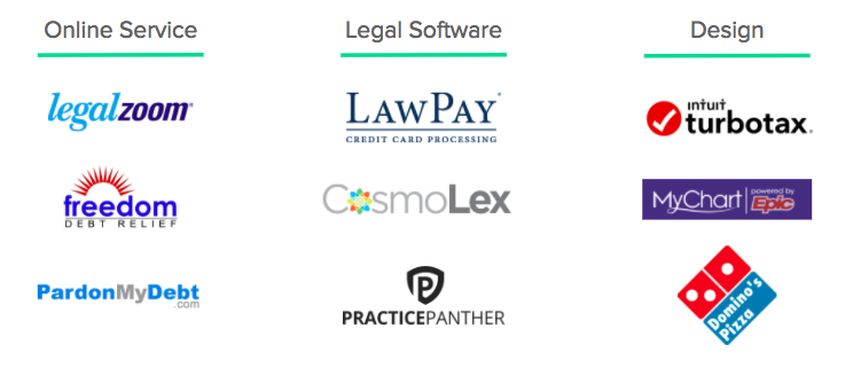
We researched competitors based on the features and opportunities we wanted to examine as comparison
points with Upright Law.We divided them by legal service, software, and design.
points with Upright Law.We divided them by legal service, software, and design.
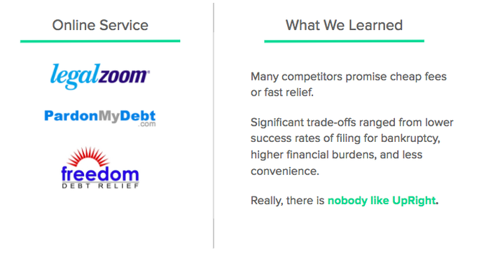
From what we found, Upright Law is the premier bankruptcy law firm that offers flexible virtual services with an extensive nationwide network. While Upright charges mid-range fees for their services, the competitors that we researched offer cheap fees and fast relief that come with lower filing success rates, more financial burdens, and less support. In short, Upright's service is in a league of its own.
Legal Software
LawPay is the top legal payment processor that allows users to add a new charge, receive refunds, review transactions, set up recurring payments, and be able to report on payments made.
It is a responsive web platform, and the mobile layout includes an off canvas menu and scalability that makes it convenient to navigate. |
Cosmolex is a legal cloud management platform that provides attorneys with billing, management, and accounting services. It strives to be a one-stop-shop for practicing lawyers, and its payment service is powered by Lawpay.
|
Practice Panther is law practice management software that allows attorneys to manage and organize logistics and communicate with their clients.
However the caveat is that anyone can apply for an account and there isn’t a high level of credibility affirmation, so there is a chance that clients can be conned or scammed through this platform. |
Lawpay and Cosmolex emulate what Bridge Legal eventually wants to create for Upright Law: a digital platform with flexible payment options, resources, and communication lines. Practice Panther has a comprehensive legal management platform, but is for attorney practice management.
Upright Law stands in the middle of the competitor pool. There aren’t any other services that offer both remote bankruptcy case
consulting and a client payment portal for free. However, Cosmolex and Lawpay have the payment processor options that Upright
doesn’t have, thus giving users more flexibility and control over their payment plans.
But what does Upright Law have that they don’t have?
A client portal. Upright Law gives bankruptcy filers a place to track their progress and contact credible professionals.
What can Upright Law take away from our service competitors?
Provide flexible payment options and streamlined ways to communicate with the Upright Law team.
Design
We explored impactful design patterns in several products outside of legal software for inspiration.
We explored impactful design patterns in several products outside of legal software for inspiration.
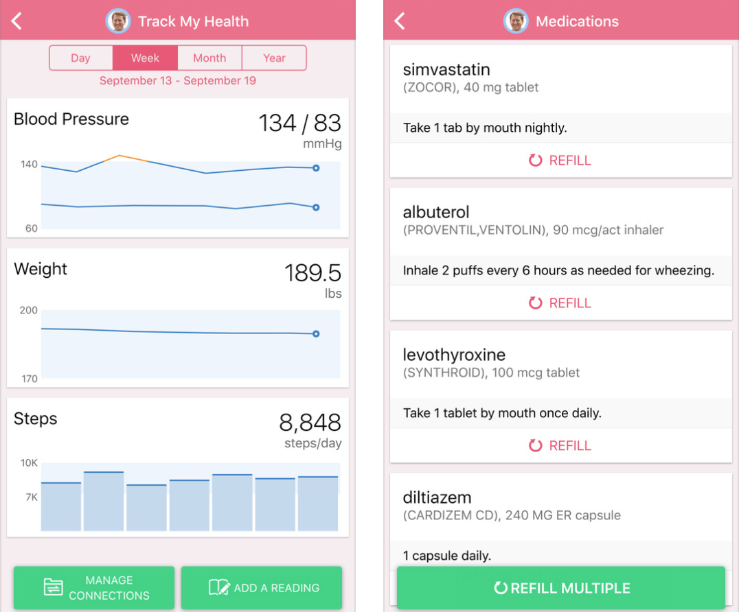
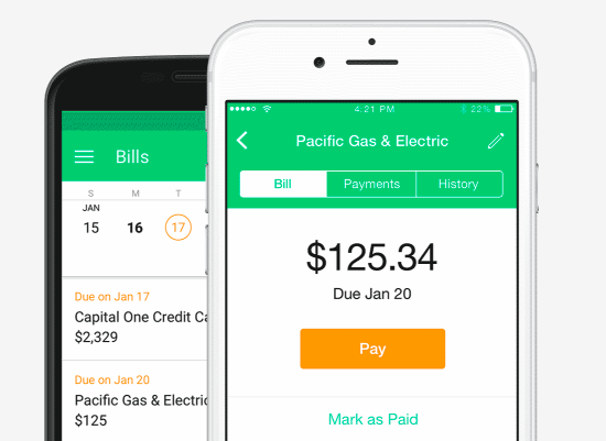
MyChart is a medical mobile app that provides users with medical records, scheduled appointments, results, and doctor-client messaging. According to Jocelyn, it’s really easy to use and what she would want the product to look and feel like.
The app features pre-determined topics and responses on a launchpad menu. Billing is included on the app, and you can also dial in with credit card info. Users can save credit card info and verify accounts with touch ID. Notifications pop up every time a bill comes up, which encourage users to stay on track with their medical dues. |
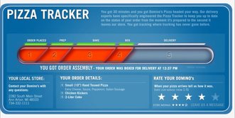
Domino’s Pizza has a tracker that shows users in real-time the status of their order. We felt that this tracker was an improved version of Upright Law’s current tracker, and it was more informative, with distinct colors to indicate status and details about what users should expect, including the local store address, what they ordered, and estimated delivery date.
|
Mint is a personal finance program that allows users to keep track of their budgets and credit scores. The product features clear and simple calls to action with digestible language that makes finance management easy for users. We also liked how the information was sectioned into bite sized cards with organized clarity. We thought about adopting this design pattern for the Upright Law client portal to make payments hassle free and resources accessible.
|
Talking to our users
We interviewed 7 users: 5 current clients and 2 external bankruptcy filers.
We interviewed 7 users: 5 current clients and 2 external bankruptcy filers.
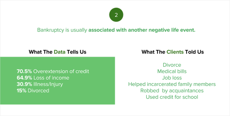
Every user had a distinct story to tell about the pain that led them into filing for bankruptcy. But behind each story was a common thread of motivation, willingness to change, and determination to push through their current endeavors. Clients all shared a proactive attitude towards completing their bankruptcy filing as well as frustrations from being harassed by creditors.
|
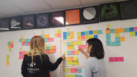
Through affinity mapping, we were able to better visualize the patterns
and insights from our research. |
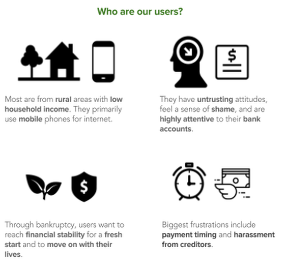
We realized that our users all had unique situations that drew them towards bankruptcy through similar motivations, frustrations, pain points, and goals. So instead of creating a detailed, case-by-case array of user profiles, we created a proto-persona that covered all of the commonalities that our users shared.
We discovered that several of our client's assumptions were wrong.
Users are not motivated by the “Speed My Payment” option because they have so many other bills to pay.
They often struggle to make ends meet after exhausting their bank accounts.
Users are harassed by creditors constantly and need help dealing with that.
Users prefer email and messaging over calling or in person meetings because they feel shame from going through bankruptcy.
What stuck out to me the most was the amount of people that decided to file for bankruptcy due to unexpected events.
The inevitability of having to deal with life’s curveballs dissipated the amount of support that users had to maintain their
financial freedom, but also led them into seeking those resources and ultimately finding Upright Law. All of the users that
we talked to are determined to go through the bankruptcy filing process persistently to reach financial stability and move on
with their lives.
Data Synthesis
During our interviews, we were able to synthesize feedback from our users into five key insights.
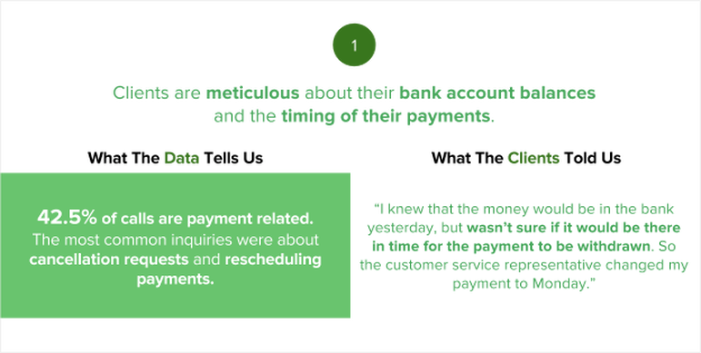
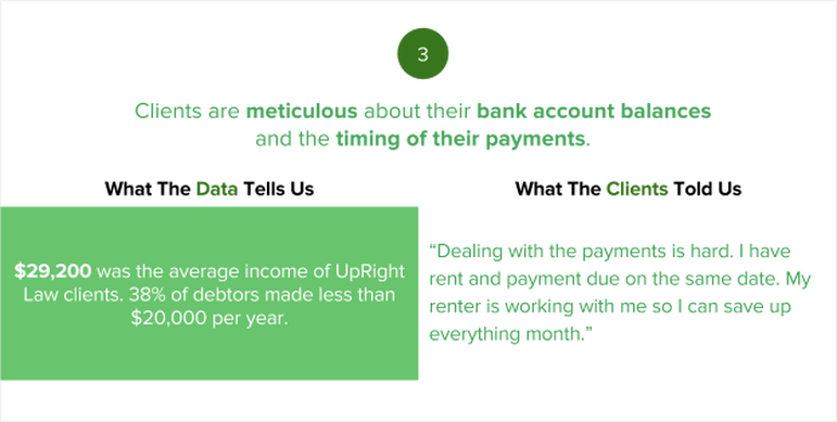
As we started synthesizing our research, we realized that the biggest barrier
for users was the lack of flexibility with depositing and changing payments.
for users was the lack of flexibility with depositing and changing payments.
|
Our clients, however, were fervently focused on improving their key performance indicators, increase in accelerated
payments being top priority. There seemed to be a lack of deeper understanding for their users, and while they pride themselves in top notch customer service and being flexible with the service support, that level of service seemed to be missing in the payment portal. Matt, the VP of product, suggested a payment timer that would notify users the time they have left to pay before their case closes in order to motivate them to pay. However, our team thought differently. From what we heard from our clients, we felt that they would be discouraged and overwhelmed by the notification. We identified the opportunity to increase the flexibility for payment changes and access resources. Our team felt that the users were not being taken into consideration with the key performance indicators. The top key performance indicators were reducing cancellations rates, increase collection of funds, and reduce labor costs. From our research, we were able to narrow down the scope of where the users were experiencing the greatest pain points. |
So what is the problem?
Before becoming clients with UpRight Law, bankruptcy filers face social stigmas, creditor harassment,
and constant fear of losing their assets, leaving them anxious and unsure about their future.
Once individuals become UpRight Law clients, they go through an initial pre-filing payment period,
during which there are few touch points between UpRight Law and the new client, unless they call in.
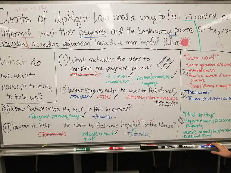
Clients of UpRight Law need a way to feel in control and informed
about their payments and the bankruptcy process so they can
visualize themselves advancing towards a more hopeful future.
Before becoming clients with UpRight Law, bankruptcy filers face social stigmas, creditor harassment,
and constant fear of losing their assets, leaving them anxious and unsure about their future.
Once individuals become UpRight Law clients, they go through an initial pre-filing payment period,
during which there are few touch points between UpRight Law and the new client, unless they call in.
Clients of UpRight Law need a way to feel in control and informed
about their payments and the bankruptcy process so they can
visualize themselves advancing towards a more hopeful future.
I felt that with the problem we identified, we could definitely address the KPIs and help the product come full circle. Presumably,
providing Upright Law clients with control and up-to-date information on their payments would allow them to take ownership of their
financial futures in the long run.
providing Upright Law clients with control and up-to-date information on their payments would allow them to take ownership of their
financial futures in the long run.
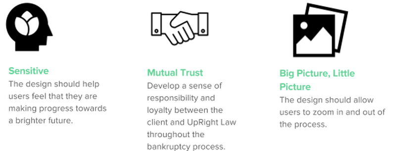
We developed the following design principles to reflect empathetic
cognizance towards the frustrations and motivations that our users have.
cognizance towards the frustrations and motivations that our users have.
Heuristic Evaluation of Current Wireframes
We went back to the current wireframes and website to assess how well they were adhering to our design principles.
We went back to the current wireframes and website to assess how well they were adhering to our design principles.
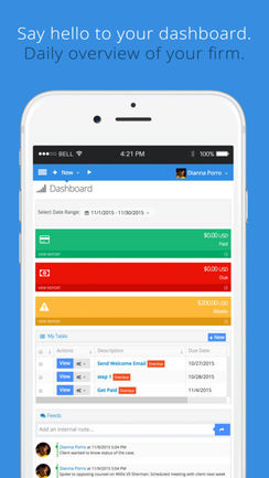
The main account page has three primary functions: viewing current payment progress, speeding up payments, and client testimonials.
Constraints: Clients are not able to change their payments, make a regular payment, or access resources via messaging or frequently asked questions.
Constraints: Clients are not able to change their payments, make a regular payment, or access resources via messaging or frequently asked questions.
The dashboard wireframe they sent us shows the user where they are in the overall bankruptcy and payment process.
Constraints: The user is unable to request or make changes to their payments and find immediate answers to their situations.
Constraints: The user is unable to request or make changes to their payments and find immediate answers to their situations.
Generating Ideas
With our insights clearly mapped out, we started discussing what kinds of concepts would best address the needs of our clients.
With our insights clearly mapped out, we started discussing what kinds of concepts would best address the needs of our clients.

In order to best understand if our concepts were going in the right direction, we dissected our problem
and created guiding questions at a high level. We used these questions to generate concept-specific inquiries
that would help us further understand the needs of the users and how we could diverge.
and created guiding questions at a high level. We used these questions to generate concept-specific inquiries
that would help us further understand the needs of the users and how we could diverge.
Our Concepts
|
Ideation Insight #1:
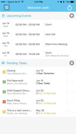
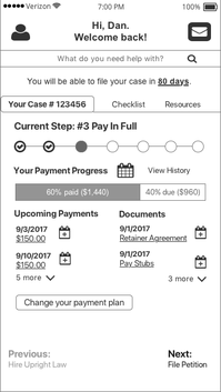
When asked what they would add to the current client portal, most users wanted to know where they are in the bankruptcy process and what documents they would need by when. Journey Tracker
Step by step bankruptcy guidance 
Key Features
User Dashboard Payment Calendar Payment Change Confirmation
|
Ideation Insight #2:
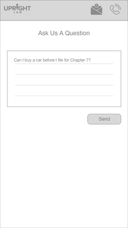
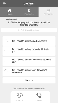
Clients have a lot of legal questions and experience a lot of anxiety over it. Our research revealed that clients search these questions on Google first before contacting UpRight Law. FAQ + Contact Hybrid
Quick access to authentic resources 
Key Features
Resources by Trusted Sources Integrated Contact Us Real-life Outcomes of Bankruptcy Client/Attorney Messaging |
Ideation Insight #3:
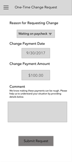
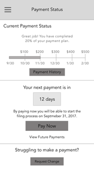
Users pay close attention to their finances and want to stay on top of where they are in the payment process. Payment Change Request + Status
Track and change payments flexibly 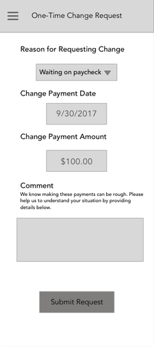
Key Features
Request changes/postpone payments Indication of Payment Status Effects of Changing Payments |
Journey Tracker Ideation
I came up with the journey tracker concept after learning that users want more guidance and notifications throughout the process about what kinds of documents they need, what each step entails, and how far along they are in the process. I wanted to provide an easier way for users to access the information they need and be provided with proactive resources through a streamlined process.
Initially, I considered a checklist concept, but felt that the completed and upcoming dates sections on the dashboard already fulfilled the same intent. I then decided to add a payment change flow to complement the payment calendar to see how users would react to the compatibility of the two.
|
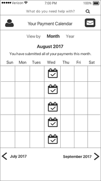
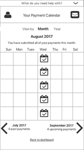
I also included a calendar that would show them all of their payment information in month and year formats.
|
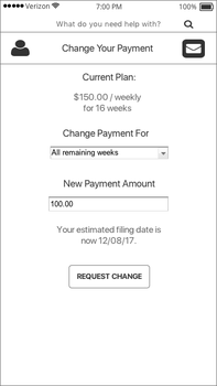
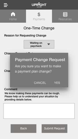
This form allows users to
change their payment and immediately see the change in their estimated filing date. |
Testing our concepts

|
We interviewed 5 existing clients and 1 external bankruptcy filer to receive feedback on our designs.
We wanted to make sure that our testing was accurate and detailed as possible, so we made sure that each of our interviewees was able to share their screen and access a computer. For each testing session, we asked clients questions based on the four key problem solving points that we brainstormed when we first started tackling the problem. |
|
What helps the client to feel in control?
|
What helps the client to feel informed?
|
|
All of our users found the payment change request
and integrated contact us to be very easy to use. |
The payment tracker and resources page made it convenient
for users to access help and important information. |
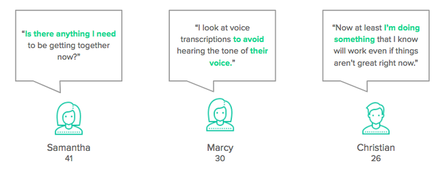
"Sometimes I can’t sleep and questions will pop in my head...These are questions you don’t think to ask when you are talking to the attorney and having that within the portal is a huge help.” -M
|
“If I can make an adjustment
to my payment it makes me feel like I have the power to do something." -M |
“I want to know where I stand with my payments at all times.” -K
|
“I always go to the website, I won’t call if I can avoid it. I don’t want to be transferred 3 times and put on hold.”-W
|
|
What helps the client feel hopeful towards the future?
|
What motivates clients to complete the filing process?
|
|
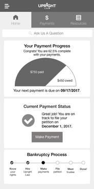
Users thought that the payment status was reassuring and motivating.
|
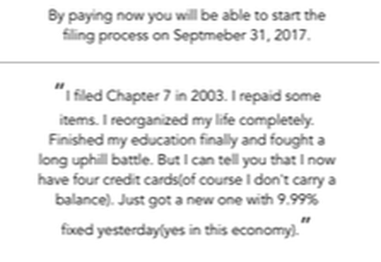
Users felt motivated to complete the payment process from the payment status and positive, encouraging language.
|
“It motivates me to stay on track and is a nice reassurance
when you see it in writing like that. It’s another line to inform the user that their petition date will be pushed back if you’re not following your original plan date.” -M |
“I appreciate that the language feels realistic. Struggling to make a payment is how it feels. It makes me feel understood and tells me the benefits of staying on the plan to move with a fresh start.” -C
“Being able to make changes and knowing how it affects the case gives me a clear understanding of the consequences.” -K
|
What didn't work?
|
|
|
A couple of UpRight Law clients remarked that the testimonials felt too gimmicky or promotional. None of the users we tested noticed them without guidance.
|
Most UpRight Law clients reported that they preferred to use their own calendar from Google instead of a calendar within the portal.
|
So what did we learn?

Language was a huge determinant of the desirability of concepts. Users appreciated positive, friendly language and straightforward, flexible information. All users responded positively to showing the payment tracker, payment change request options, and filing status up front as soon as they enter the portal. Users also validated our assumptions on wanting to find information as best as possible without calling in.
Creating our converged product
For our converged concept, we decided to refine the concepts that worked and configure them into a simple and practical IA.
For optimal convenience, we decided to create three tabs: dashboard, payments, and resources, and emphasized
two key design patterns: responsive top navigation for ease and cards for organization.
For optimal convenience, we decided to create three tabs: dashboard, payments, and resources, and emphasized
two key design patterns: responsive top navigation for ease and cards for organization.
|
We created a simple portal login page with the logo and text field for the client ID.

|
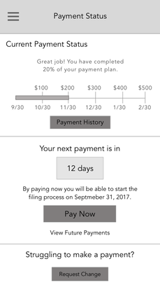
The dashboard gives a clear snapshot of the user's payment status and information in one stationary place.
|
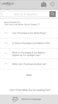
The resources section allows users to easily ask questions and view answers to frequented issues and topics.
|
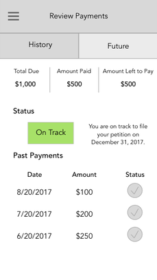
The payments page empowers users to see their payment status and history, and make payment change requests.
|
Usability Testing
|
Who We Tested
4 Upright Law Clients We didn’t test clients who were unable to access a computer or screen share. Some also cancelled. |
We used the following questions to guide our testing.
How easy was the task? What could make it easier? How valuable was the functionality of the prototype? How was the product interpreted? Were all intended purposes made clear for the client? What were the best parts of the product, and what was less useful? |
What Worked
- Top navigation was easy for clients
- Clients easily understood the meaning between the different pages
- Task flows were intuitive
- All 4 users successfully completed the tasks, most commonly heard there was no confusion
- Language and information was understandable
- Validated going with cards to break up information
- "I like that the wording is simple to understand, unlike a lot of other sites" - M.
What didn’t work
- Timing at the end of the change process
- Making an early payment and how that affects scheduled payments
Did we solve the problem?
To determine how successfully we addressed the problem, our team went back to the four initial
assessment questions we created and reflected on the client feedback we received.
To determine how successfully we addressed the problem, our team went back to the four initial
assessment questions we created and reflected on the client feedback we received.
|
Did the client feel in more control?
Clients did feel more in control because they were able to see their payments and take action right away with changes and updates on their progress. “It helps me manage payments easily. Being able to make a payment change request is huge and I really like that.” Did the client to feel hopeful towards the future?
Clients did not feel more hopeful towards the future because they see hope as a self-generated incentive and don’t find it from the payment process. They don’t think that utilizing the website to pay their retainer fee makes them feel more hopeful, but it’s a necessary step towards financial freedom. “In terms of the portal, I don’t feel more or less hopeful. It is just a tool.” |
What helps the client to feel informed?
Clients did feel more informed when they are able to see information about their bankruptcy filing according to what they search in the resource section, contact us, and payment options. “This portal is meant to empower, give comfort, and show information. The more information we can be given, the better.” Did the client feel more motivated to complete the payment process? Clients did feel more motivated to complete the payment process because it made them feel respected through the new options that are available to them regarding payment changes and resource accessibility. “Normally when I’m paying bills I don’t get to visually see my payment making a difference, the portal allows me to see I’m making progress.” |
So, how did we do?
We helped the clients feel more in control, informed, and motivated to complete the payment process.
We did not help the client feel hopeful towards the future. We learned that hope is a self-motivated piece that the product wouldn’t necessarily provide.
After presenting our final prototype and wireframes to our clients, they were satisfied with the work we accomplished and told us that our designs would be incorporated into the future versions of the client portal.
Recommendations
- Interview people who have cancelled their service or are frequently late on payments.
- Explore and test out features recommended by clients, as well as the formatting of both desktop and mobile platforms.
- Uploading documents
- Scheduling credit counsel
- Preparing for meeting the trustee or video call within the portal
- A/B/C test our proposed portal with the current portal and the proposed portal from the other firm.
Reflection
I learned about the ins and outs of the bankruptcy filing process, which was initially an unfamiliar domain, and enjoyed solving for the caveat between the law firm and their clients that we could mend through the scope of this project. Being able to hear about struggles that users go through during the process was very refreshing and valuable.
Their raw and honest stories highlighted the disparity in financial education and resources that people experience depending on their socioeconomic status and allowed us to better understand their circumstances to adjust the functionality of the product more closely to
their needs. One thing that emanated from each and every client was their resilience and willingness to stick with the filing process for
a better future. Each of them had strong self-awareness that carried them through their current obstacles and encouraged them to consistently stay on track of their payments.
Their generally optimistic and mature attitudes derived from their depth of experience and self-reflection, which helped us create a product
that better addressed the needs of our users compared to the previous client portal designs. I am grateful to have been able to work with a law firm that provides great customer service and is open to changing their minds about their business goals through the findings that we shared. The increase in engagement and empathy that I saw from our clients encouraged me to become more assertive as an advocate for the user by developing designs that are reflective of research insights and user feedback.