Brief |
My teammates and I were tasked with creating a digital product for the CTA that can identify
slowdowns and problems, help riders find alternate routes through transparency, and offer flexible solutions help increase customer satisfaction. |
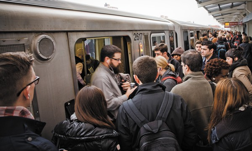
The Chicago Transit Authority is the second largest public transit system in the US, and approximately 1.4 million riders
use their services every day. I have taken the CTA regularly since the age of 16, and was eager to find out more about users
and what the big picture story is. I worked with Jane Kim, Pedro Santillanes, and Stephanie Gough on this project.
use their services every day. I have taken the CTA regularly since the age of 16, and was eager to find out more about users
and what the big picture story is. I worked with Jane Kim, Pedro Santillanes, and Stephanie Gough on this project.
Diving into research |
|
Initially we wanted to explore what kinds of experiences CTA riders were having, who they were, and what their pain points are. We proceeded to embark on a journey full of questions, ideas, and iterations that gave us a lot of insights on what our users needed and how the scope of our project would be able to accommodate them.
We started off by doing some domain research on the public transit sector and the Chicago Transit Authority. From our research we found several issues that stood out the most: Last Mile Problem “I come in every day on Metra, but I struggle with the last-mile problem. Every time I go somewhere, I think, ‘Can I do it on transit?’ I throw up my hands sometimes because I know it’s going to be a $20 cab ride when I get to the station.” - Metra / CTA Rider Public-Private Partnerships to reduce # of cars on road "But to achieve truly integrated travel in Chicago, the city and private companies will need to move past their differences and collaborate." - Peter Skosey, Executive Vice President for the Metropolitan Planning Council. With transit issues being so vast, we started to anticipate that the scope we could solve for realistically would be the frustrations users deal with from the “last mile problem.” |
Competitor Landscape |
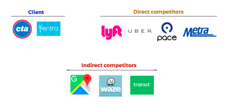
We researched our competitor landscape for navigation and travel apps based on popularity, relevance, and
personal familiarity. We identified our top three competitors as Transit, Waze, and Google Maps, all initially
considered indirect competitors due to the fact that they don’t offer public transportation services. However, we
soon saw them as direct competitors since they are the top notification and navigation service rivals of the CTA.
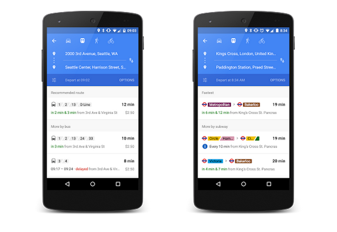
Google Maps is a comprehensive navigation service that offers satellite imagery and street views, real-time traffic conditions, and route planning for traveling by foot, car, bike (beta), and public transit. The trade off is the limited accuracy and lack of real-time information on unusual weather or road construction.
|
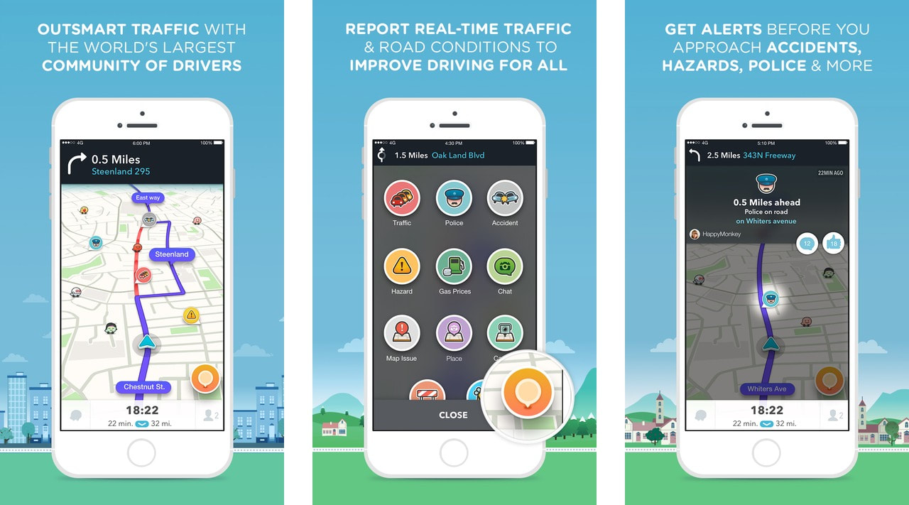
Waze is a navigation app for drivers that is based on community-sourced information. The app gives clear alternate routes, turn-by-turn navigation, real-time alerts on nearby drivers, and traffic updates through user info sharing. However, the scope of transportation is limited to driving.
|
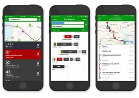
Transit is a public transportation navigation app that shows real-time predictions and customized route guidance for public transit and ride services. However, there is no filter for transit and ride options, nor are there biking or ride directions in conjunction with public transit.
|
Key Takeaways
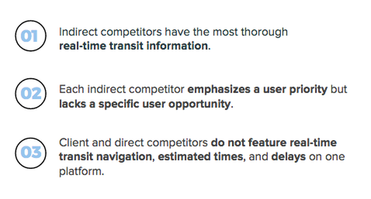
Through our competitor analysis, we found that our digital navigation competitors had the most thorough
real-time transit information with specific user priorities in mind. However, we noticed that none of them
featured real-time transit navigation times and user generated notifications on one platform.
real-time transit information with specific user priorities in mind. However, we noticed that none of them
featured real-time transit navigation times and user generated notifications on one platform.
User ResearchOur challenge enabled us to differentiate our product and have a competitive edge inherently based on the population we were serving. After identifying this fact, we wanted to see if our users, SMEs, and stakeholders would validate these needs, and how the interpretation of these features would change based on our findings. The primary goal was to identify the needs, motivations, goals, and frustrations of CTA riders.
|
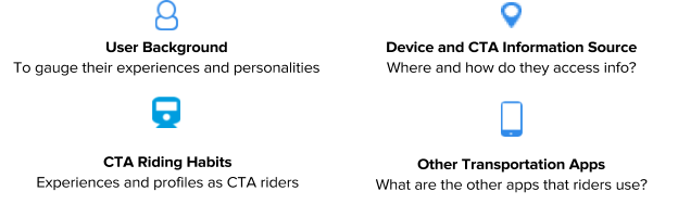
Through our user interviews and surveys we wanted to gauge four main areas:
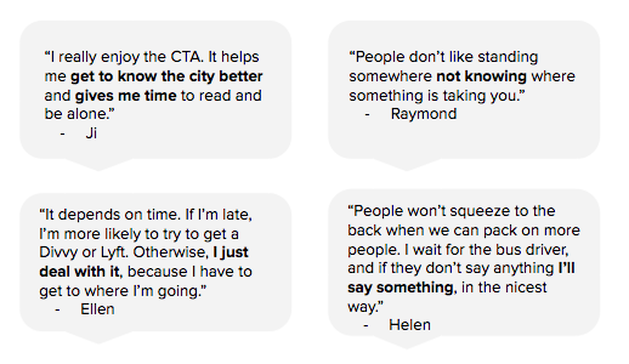
We interviewed 10 people total: 7 users, 1 SME, and 2 stakeholders. Our users were primarily millennials (mid 20s-early 30s).
Overall they expressed varied motivations and the need for proactive information and positive rider culture.
We noticed trends in their use of apps, frustrations with navigation services, and what they need to have a better experience on the CTA.
Overall they expressed varied motivations and the need for proactive information and positive rider culture.
We noticed trends in their use of apps, frustrations with navigation services, and what they need to have a better experience on the CTA.
We also shared a survey with 77 respondents via Facebook and the Chicago transit forum asking about their CTA riding
habits and behaviors. 60% of them are living and working in Chicago, and 89% of them have been riding for more than one year.
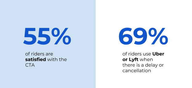
More than half of them were satisfied with the CTA, and they primarily use Uber or Lyft when there is a transit delay or cancellation.
habits and behaviors. 60% of them are living and working in Chicago, and 89% of them have been riding for more than one year.
More than half of them were satisfied with the CTA, and they primarily use Uber or Lyft when there is a transit delay or cancellation.
User Insights
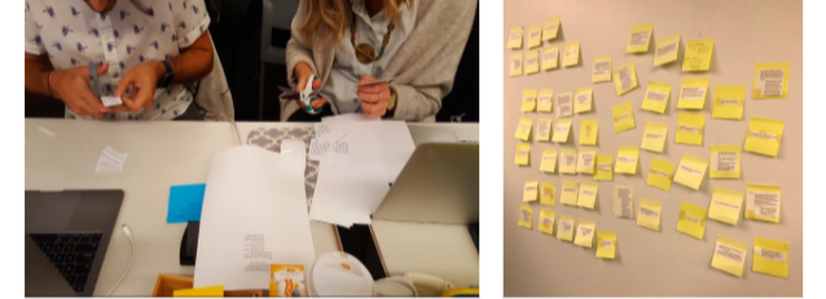
Through collaborative data visualization and insight articulating methods including
brain writing and affinity mapping, our team was able to uncover several profound insights.
brain writing and affinity mapping, our team was able to uncover several profound insights.
|
01
Being late is very uncomfortable and unpleasant. Traveling during peak hours accumulates stress. 02 Users aren't able to share information with each other due to the lack of communication between riders and the CTA. We found that users don’t know much about what happens when they are notified of delays, and the information is often not live, which keeps them from tracking their commutes accurately. 03 There is a fragmentation in the use of apps. Some users use a mix of transit apps/resources for different features. |
04
Users respond to delays in two ways. Wait it out or be proactive. 05 CTA has certain constraints that users are unaware of. There are ongoing socio-economical and political issues that create barriers for the CTA and challenge the means to improve rider satisfaction and service quality. 06 Users have an effect on transit just by using it. We found out that CTA ridership correlates positively with service frequency. When ridership goes up, the amount of trains and buses serviced goes up. |
What motivates
|
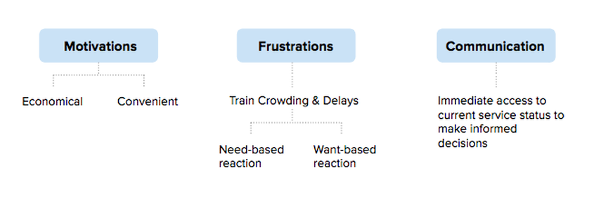
We found out that riders are primarily motivated by cost-efficiency and convenience of taking the CTA. When they face frustrations from train crowding and delays, users will either respond with what is necessary or what they desire. Their desire for immediate access to transit status lies in the ability to make informed decisions for successful commutes.
|
So who are our users? |
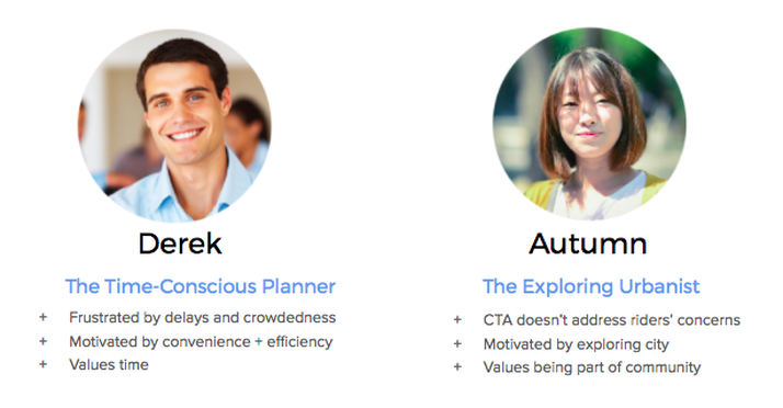
From our user interviews we were able to identify two main types of users: the time-conscious planner who seeks convenience and service,
and the exploratory commuter who values community and likes to be proactive. Both of our users are millennials because their generation
has the highest impact on ridership and likelihood of changing the trajectory of rider culture. We visualized our data and synthesis with
journey maps and use cases to narrow down the scope of our project.
As we developed cohesive user personas, our team was able to synthesize research insights to identify the problem.
The experienced Chicago transit commuter needs a way to access real-time information
about service status and available alternate transit options because a lack of immediacy
and transparency hinders them from making informed decisions for satisfactory travel.
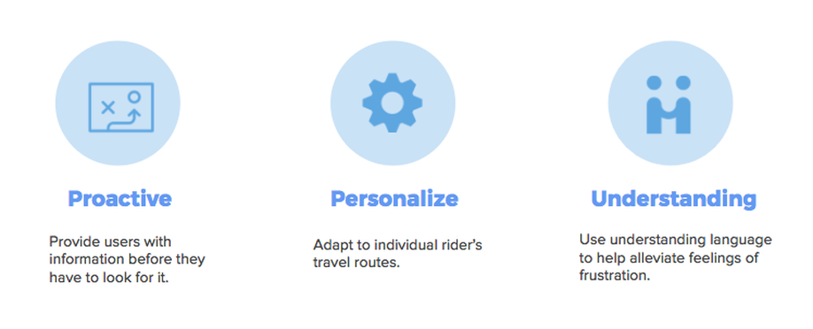
To accurately reflect user-centered mindfulness in our curated solutions, we created the following design principles:
Synthesis & Ideation
How can we help our users?
Based on the feedback that we received, our team started to ideate possible concepts and features to explore.
Each of us had divergent ideas that we built upon and critiqued as a team through a brain writing session.
We then printed out and mapped our ideas to find trends and connections to decide on which features to conceptualize.
Each of us had divergent ideas that we built upon and critiqued as a team through a brain writing session.
We then printed out and mapped our ideas to find trends and connections to decide on which features to conceptualize.
We explored two different versions of live delay notifications and alternate routes. Though we diverged
on versions of these features, we had already converged on what we wanted the app to include. Each of us
created an app name to go with our concept, which you will see in the "Testing our concepts" section for your reference.
on versions of these features, we had already converged on what we wanted the app to include. Each of us
created an app name to go with our concept, which you will see in the "Testing our concepts" section for your reference.
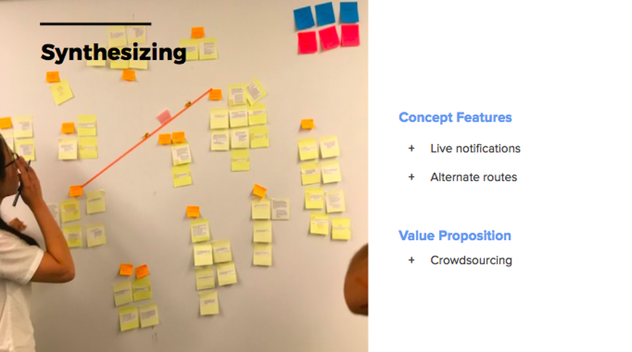
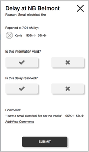
We unanimously chose crowdsourcing as our differentiator because users felt more proactive through the
notifications they would receive live from real people, enabling them to foster trust through genuine human
connections. All of our concepts included GPS tracking, live information, and geo-locative navigation.
notifications they would receive live from real people, enabling them to foster trust through genuine human
connections. All of our concepts included GPS tracking, live information, and geo-locative navigation.
|
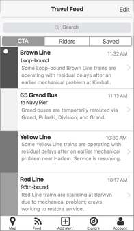
Concept 1: Live travel feed (nxt)
Provides delay details from users, CTA, Twitter, and a variety of posting abilities. The user can also proactively view and search alerts.
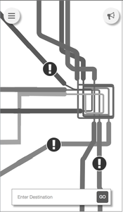
Concept 3: Live Navigation Guide (navi)
Shows fastest routes in real time with step-by-step navigation and provides live delay notifications and alternate route options.
|
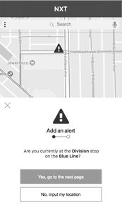
Concept 2: Navigable delay alerts (raiL)
Users can view and report live delay alerts on the map powered by Google Maps API.
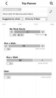
Concept 4: Trip Planner (alt-L) Sends live notifications about delays, shows reports from other riders, and suggests alternate routes.
|

|
Concepting Navi
|
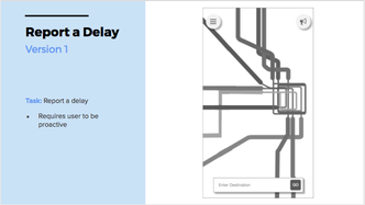
I developed the live navigation guide as a means of providing a familiar and proactive way for
users to receive delay information in real-time with alternate route options. |
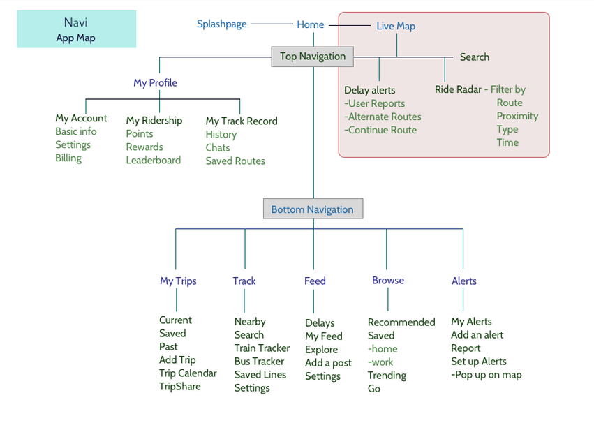
I created an app map that included all of the primary functions of the CTA website and the needs that we identified from research.
Based on our research, I devised categories that would best address personalization and user behaviors. My preliminary sketches
focused on developing a live transit map with alternate routes and delay alerts, which were iterated upon based on feedback from user testing.
Based on our research, I devised categories that would best address personalization and user behaviors. My preliminary sketches
focused on developing a live transit map with alternate routes and delay alerts, which were iterated upon based on feedback from user testing.
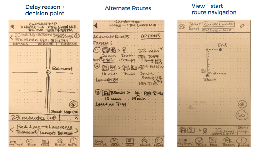
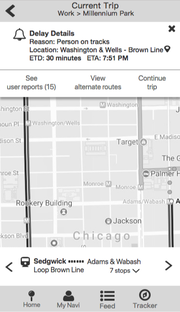
I developed a screen flow with in-app delay notifications featuring details, convenient calls to action to take
next steps, and customized alternate routes. To address proactivity and punctuality, I created in-app delay
notifications that would allow users to choose which side of the reporting and routing they wanted to be on:
proactively reporting and rerouting, or continuing on their intended route after viewing reports.
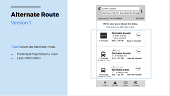
What did users think of this concept?
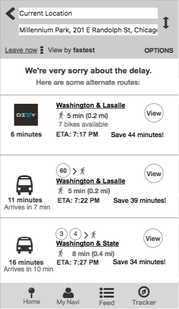
Users appreciated the nearby and alternate transit options, as well as the in-app delay notification
that gave details on the cause, estimated delay time, and user-generated reports. However, users were confused by
the times for alternate routes because they weren’t sure if “11 minutes” meant how long the train or bus
would take to arrive or how long the trip would take. Some users also thought less text and
more iconography would be a more convenient and appealing way to convey route information.
next steps, and customized alternate routes. To address proactivity and punctuality, I created in-app delay
notifications that would allow users to choose which side of the reporting and routing they wanted to be on:
proactively reporting and rerouting, or continuing on their intended route after viewing reports.
What did users think of this concept?
Users appreciated the nearby and alternate transit options, as well as the in-app delay notification
that gave details on the cause, estimated delay time, and user-generated reports. However, users were confused by
the times for alternate routes because they weren’t sure if “11 minutes” meant how long the train or bus
would take to arrive or how long the trip would take. Some users also thought less text and
more iconography would be a more convenient and appealing way to convey route information.
Testing our concepts
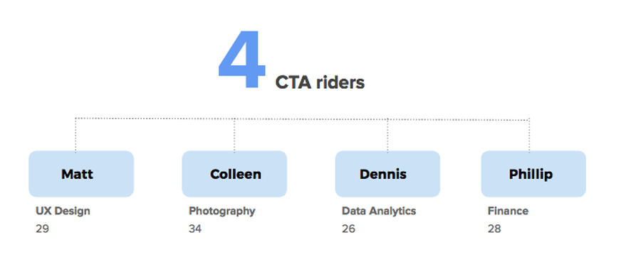
We tested our concepts with four CTA riders that fit the personas of our target users. All of our users were millennials,
whom we chose as our target audience because of the growing number of people in this age range that are using the CTA.
We also felt that they would have the highest potential changing rider culture as a younger, digitally savvy demographic.
whom we chose as our target audience because of the growing number of people in this age range that are using the CTA.
We also felt that they would have the highest potential changing rider culture as a younger, digitally savvy demographic.
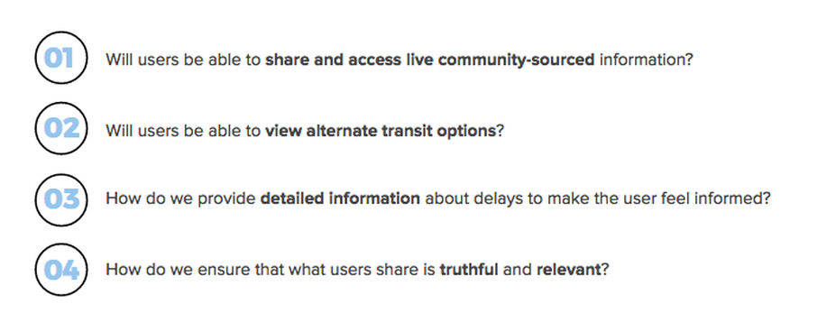
"I find value in..."
Our primary value propositions during concept testing were the ability to share and access live community sourced information as well as view alternate transit options, making them feel informed through delay notifications, and ensuring credibility and relevancy in every piece of information given. We made sure to validate the needs addressed and the level of accessibility our product provided for users. The latter questions allowed us to gauge user affinity for each concept and what we needed to work on to make the converged prototype impactful.
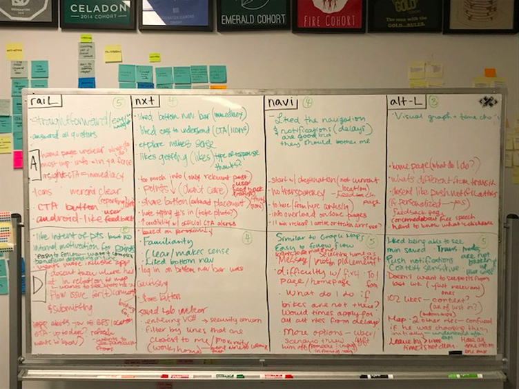
We took the feedback we received and wrote out the key takeaways by persona.
We tried to find patterns and commonalities in the feedback to help us figure out how to converge.
We tried to find patterns and commonalities in the feedback to help us figure out how to converge.
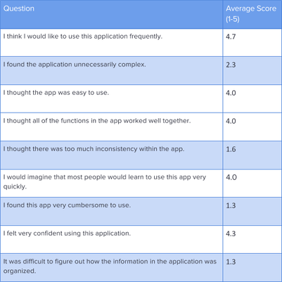
We used metrics to gauge what users thought about the convenience and desirability of the app. 1 represented strongly disagree, and 5 signified strongly agree. Users generally found the concepts to be highly desirable and useful because of their ease of use and features.
|
There were minor pain points such as verbosity or lack of proactivity from the product that users found to be inconvenient or confusing. We took these issues into consideration and iterated our converged designs.
|
|
Autumn
|
Derek
|
Overall, both types of users wanted to see immediate information that matters the
most to them: delay reports, transit information, and alternate routes.
Convergence
We combined exponentially definitive features that we deemed fit to best address the problem into our final converged product, nxt.
Here is a walkthrough of key screens in the converged prototype.
nxt
A navigation app that allows users to access and share real time information about CTA delays
and offers the best alternate routes through crowd-sourcing and Google Maps API.
Usability Testing & Feedback
Our main objective for the usability testing was to gather data about the overall effectiveness of the mid-fidelity prototype.
We focused on four key considerations to determine how successful we were in achieving our goal:
We focused on four key considerations to determine how successful we were in achieving our goal:
|
01
Confirm users understand the overall goals of the app |
02
How easy is it for users to complete the following tasks? Viewing a notification Finding an alternate route |
03
What are the obstacles users experience during the tasks? |
04
Does the flow make sense contextually? |
Scenario:
"You work downtown at a 9-5 job. You receive a pop up notification about a delay
on your normal commute route, which you have already personalized in the app.
Your task is to view the delay alert and then find an alternate route."
"You work downtown at a 9-5 job. You receive a pop up notification about a delay
on your normal commute route, which you have already personalized in the app.
Your task is to view the delay alert and then find an alternate route."
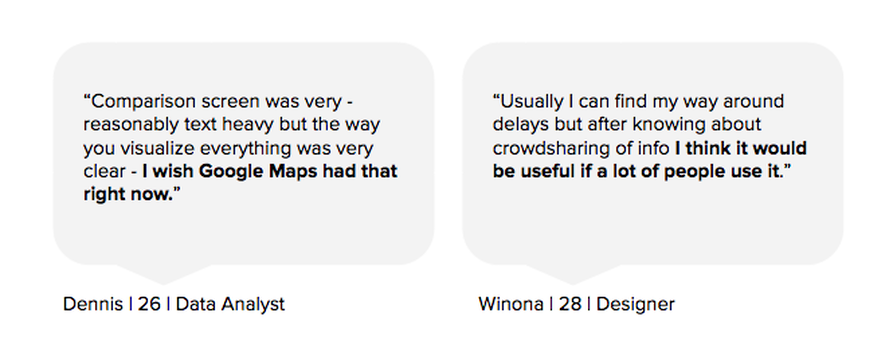
We tested our converged prototype on two users: one time conscious planner, and one exploring urbanist. Generally, both
users appreciated the visual display of transit information and saw value in crowd-sharing info about delays.
users appreciated the visual display of transit information and saw value in crowd-sharing info about delays.
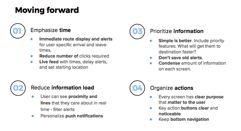
Future Recommendations
|
01 Test more diverse pools of users with iterated prototypes. 02 Adjust and improve upon clarity of language to diverse contexts. 03 Explore the rest of the IA and build out screens for future features. |
04 Conceptualize more incentives for users through gamification. 05 Find ways to strengthen reflection of design principles in product. 06 Bridge alerts and alternate routes. |
For future considerations, we included enhancing the clarity in the language and icons,
connecting alerts and alternate routes seamlessly, and exploring gamification further to motivate users.
For future considerations, we included enhancing the clarity in the language and icons,
connecting alerts and alternate routes seamlessly, and exploring gamification further to motivate users.
Click here to see the final clickable prototype.
Reflection
This was the first in-person user experience research and design project that I partook in. I learned how to put theory to practice by always asking, "Why?" and think deeply about user needs and frustrations through multiple angles and posits for exploration. I also became acclimated to managing multiple tasks and strategizing effectively within time-sensitive sprints to garner valuable results. Working as a user experience designer challenged me to constantly iterate and assess the trajectory of our product through our research insights. I learned to be comfortable presenting information in an honest, original way that didn't hinge on standard regulations or obligations, but rather solely on the needs of the users and value that the product could provide for them.
As a Chicago native and frequent CTA transit rider, I was excited to learn about the scope of CTA ridership and problems that both riders and staff face. Going through the design process in a short amount of time helped me learn how to balance efficiency with flexibility while seeking out key information and strategies that would best accommodate our users. I found profound joy in being able to solve a problem by identifying user pain points within the scope of a profoundly impactful product to produce something that would genuinely address their needs and catalyze successful commutes through positive human connections. As a user experience designer, all of my work is intended to help bring people closer together through trustworthy and meaningful contexts; this project allowed me to explore scope as a designer and get into the groove of practicing design thinking and advocating for users by reading in between the lines to solve the problem.
As a Chicago native and frequent CTA transit rider, I was excited to learn about the scope of CTA ridership and problems that both riders and staff face. Going through the design process in a short amount of time helped me learn how to balance efficiency with flexibility while seeking out key information and strategies that would best accommodate our users. I found profound joy in being able to solve a problem by identifying user pain points within the scope of a profoundly impactful product to produce something that would genuinely address their needs and catalyze successful commutes through positive human connections. As a user experience designer, all of my work is intended to help bring people closer together through trustworthy and meaningful contexts; this project allowed me to explore scope as a designer and get into the groove of practicing design thinking and advocating for users by reading in between the lines to solve the problem.